7.12.2011
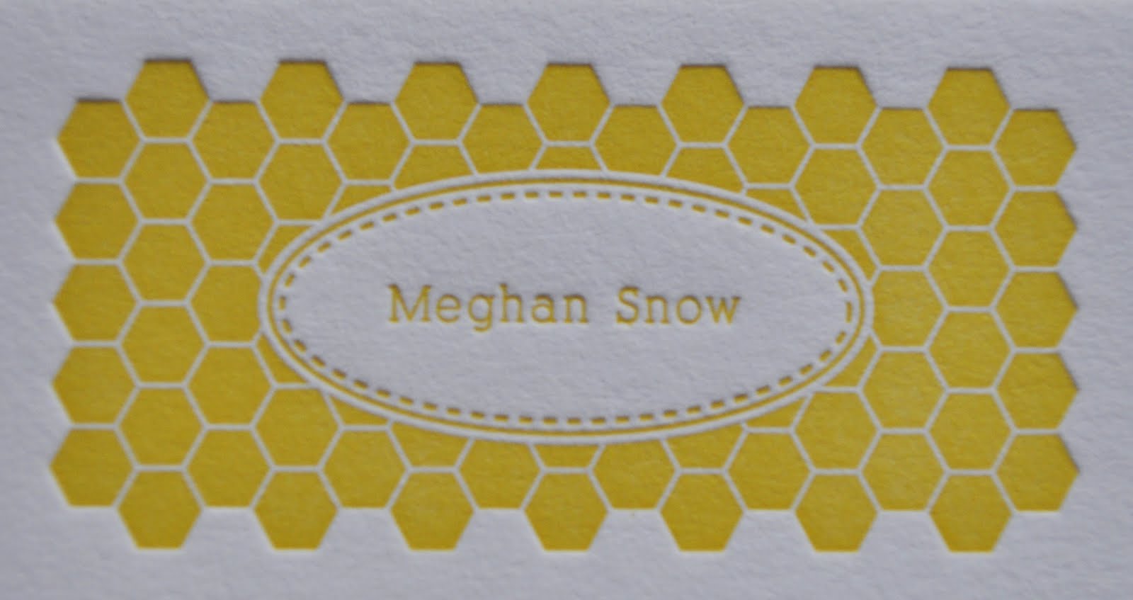
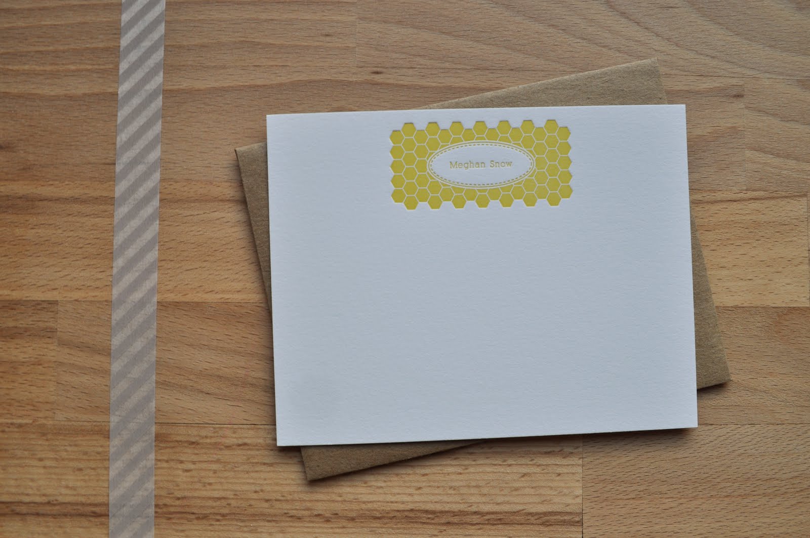
honeycomb inspired personal stationery
When Meghan approached me to design and print her personal stationery she had two requests. Honeycomb + jam label. She loves bees + jam and even makes her own jam! These pretties are printed in cheery yellow ink on 110 pound paper. It's fun to play with different textures in a piece when you're printing in just one color. Between the label and the honeycomb pattern, this piece has so much texture that it seems more like a two color print since the white paper appears to be a second color.
7.07.2011
letterpress + cookies
Two of my most favorite things are letterpress + cookies. So when I started working with Dana, baker extraordinaire, from The Sunday Sweet. I knew we'd be a good match. I designed her logo and printed stationery and hang tags in lavender ink (her signature color). When I delivered her goodies, she gifted me with oreo stuffed chocolate chip cookies. These are seriously amazing, guys! I'm sure she'll post the recipe soon so you can try them, too.
6.15.2011
bite size stationery
Remember Mayumi's stationery? Well, we shrunk it down and made it bite size. Mmmm, scrumptious! If I was one of those people who liked to collect things, I'd for sure collect mini things. Because they're the cutest. I wonder how long it's going to take Mayumi to go through 80 of these lovely little notes.
5.25.2011
heart thank you cards
Handwritten type and a sweet little heart make these mustard and peach ink thank you cards irresistible. We can even customize them in any color you'd like. Great for weddings, events, or if you just have a signature color. We all have a signature color, right?
5.23.2011
tribal: a wedding suite
Do you remember high school geometry? I do. And I equate it with pure awfulness. Maybe it's because I've always had a fond love for patterns and geometric shapes. Turning the beauty of shapes into something math related? No, thank you. Designing beautiful shapes and then seeing them brought to life through letterpress? Yes, please.
5.05.2011
pattern & blind ink wedding suite
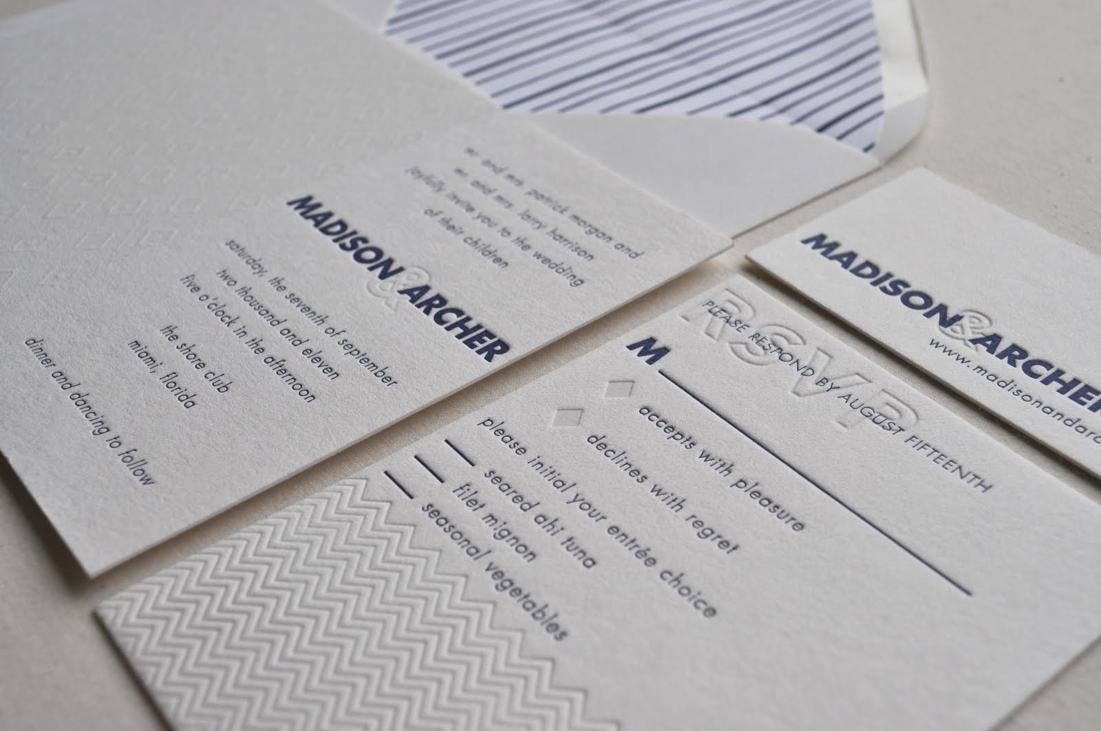
Using blind impression as an ink color is so refined and gorgeous. It's amazing that no color can make such a statement, but it totally does. And then paired with navy + pattern? Well, it's even more blissful.

5.04.2011
lovely collage featured on Invitation Crush
We're so excited that our lovely collage invitations are featured alongside loads of amazing stationery talent in Invitation Crush's Wedding Invitation Ideas Lookbook. Check it out for tons of papery inspiration.
Subscribe to:
Posts (Atom)